What Early Users Taught Me About Simplicity in Design
Planelo Team
When I first started inviting people to use Planelo, I was prepared for technical bug reports. I had my debugger ready and my error logs open. What I wasn't pr…
When I first started inviting people to use Planelo, I was prepared for technical bug reports. I had my debugger ready and my error logs open. What I wasn't prepared for was the realization that I had built things people simply didn't need. I watched (virtually) as my first users clicked around, ignored my "clever" advanced settings, and struggled with things I thought were obvious. It was a humbling masterclass in minimalism.
The most valuable user feedback product owners can receive isn't a feature request list; it’s the silence when a user encounters a feature they don't care about. I learned that every single button I added was a cognitive tax I was asking my users to pay. If that button didn't provide massive value, I was essentially stealing their focus. This phase of product iteration taught me that simplicity isn't a starting point—it’s a destination you reach after you've stripped everything else away.
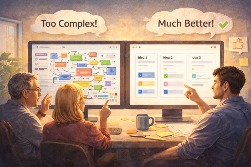
The real problem: The "More is Better" delusion
As founders, we often fall into the trap of thinking that more features equal more value. We think that if our app does ten things, it’s ten times better than an app that does one. But for the user, more features often just mean more noise. They are looking for a tool that solves a specific pain, and every extra bell and whistle is a distraction from that solution.
Most tools get this wrong by trying to be everything to everyone. They add layers of complexity to satisfy every edge case, eventually becoming the very
Why this happens: Fear of being "Too Simple"
We over-complicate because we are afraid of appearing "thin" or "unfinished." We worry that if a user can understand the whole app in thirty seconds, they won't think it’s worth paying for. Industry patterns reinforce this by marketing "all-in-one" solutions that boast about their endless capabilities.
But complexity is often just a mask for a lack of clarity. When we don't know exactly what problem we are solving, we build everything just in case. I had to learn that true product iteration means having the courage to say "no" to good ideas so that the great ideas have room to shine. I realized that my
What works better: Observation over interrogation
What works better than asking users what they want is watching what they do. People will tell you they want a complex calendar integration, but you’ll observe that they never even click the "Date" field. An alternative mindset is to treat your product as a series of experiments.
Instead of building a full feature, build a "smoke test"—a button that leads to a "coming soon" page—just to see if anyone clicks it. Practical examples of this include using "heatmap" tools or simply jumping on a 15-minute call where a user shares their screen while using your app for the first time. You’ll learn more in those 15 minutes of watching someone struggle than in 15 days of reading feature request emails.
How I approach this (founder POV)
Early on, I had a complex "Project Tagging" system in Planelo. I thought it was essential. But when I looked at the data (and talked to users), I saw that nobody was using it. They were just using the search bar. My "clever" system was just clutter.
I decided to remove it. It felt painful to delete code I had worked on for a week, but the moment it was gone, the app felt lighter. The feedback was immediate: users found the app "cleaner" and "faster." This taught me that my job as a founder is to be an editor, not just a creator. I now spend more time thinking about what I can remove from Planelo than what I can add. It’s about protecting the user's "speed of thought" at all costs.
Practical takeaway
If you are looking to simplify your product based on user feedback, try these steps:
The 80/20 Audit: Identify the 20% of features that 80% of your users use every day. Make those features prominent and consider hiding or removing the rest.
Watch a First-Time User: Sit with someone who has never seen your app. Tell them to perform one task. Don't help them. Note every place they hesitate.
Kill the "Settings" Menu: If a feature requires a complex settings page to be useful, it might be too complex for the core product.
Reward Simplicity: Celebrate when you ship a version that has fewer lines of code than the previous one.
Conclusion
Simplicity is the ultimate sophistication, but it’s also the hardest thing to achieve. It requires a deep understanding of your users and the discipline to stay focused on the core problem. My early users didn't want a more powerful Planelo; they wanted a more invisible Planelo. They wanted a tool that got out of their way so their ideas could take center stage. Listen to your users, watch their actions, and don't be afraid to keep things simple.